What Quality Setting Should You Actually Use? A Quality Ladder Test
Everyone says “use quality 80” and nobody says why. We re-encoded the same four images at nine quality steps from 30 to 100 and recorded the file size at each stop, so you can see exactly where the curve flattens and where the artifacts start.
Why “use 80” is unsatisfying advice
Every image optimization guide, this one included, tells you to set quality to 80. Almost none of them show you the curve that recommendation comes from. Without it, 80 is folklore: you do not know how much you would lose at 70, how much you would pay at 90, or whether your particular image behaves like the average one.
So we measured it. Four photographs of deliberately different character, re-encoded at eleven quality steps from 30 to 100, with every file size recorded. What comes out is a curve with a very distinct shape — and the shape, more than any single number, is the thing worth understanding.
How we tested
- The images. Four photographs, each 1600 px on the long edge, chosen to span the range that matters: dense foliage (high-frequency detail, the hardest case), a portrait (large smooth areas and skin tones), a flat neon-lit still life (broad areas of solid colour), and a small product shot that was already lightly compressed.
- The sources. All four were fetched as JPEGs at quality 90. This matters: the source is already well compressed, so the savings here are deliberately conservative compared with the typical unoptimised website image.
- The encoder.
cwebpfrom libwebp, default settings, quality varied from 30 to 100. No resizing, no metadata stripping beyond the encoder default. - The measurement. File size on disk, in bytes. We report sizes as measured and percentages rounded to the nearest whole number.
The full quality ladder
Every cell is a real encode. Sizes in kilobytes.
| Image | Source | q30 | q40 | q50 | q60 | q70 | q75 | q80 | q85 | q90 | q95 | q100 |
|---|---|---|---|---|---|---|---|---|---|---|---|---|
| Foliage high detail | 560.0 | 151.0 | 188.3 | 225.1 | 255.8 | 287.1 | 304.9 | 372.4 | 450.4 | 572.3 | 728.9 | 956.7 |
| Portrait skin, soft background | 879.2 | 100.8 | 137.7 | 191.1 | 256.1 | 340.9 | 379.2 | 504.0 | 683.0 | 897.2 | 1269.1 | 1612.8 |
| Neon still life flat colour areas | 206.0 | 40.7 | 47.4 | 54.0 | 60.6 | 67.7 | 72.3 | 86.3 | 106.2 | 143.7 | 208.8 | 307.1 |
| Product shot small, pre-compressed | 60.4 | 10.3 | 11.5 | 12.6 | 13.8 | 14.7 | 15.4 | 18.1 | 21.8 | 29.0 | 40.2 | 61.7 |
All figures in KB, measured with libwebp. Sources are JPEG quality 90 at 1600 px on the long edge.
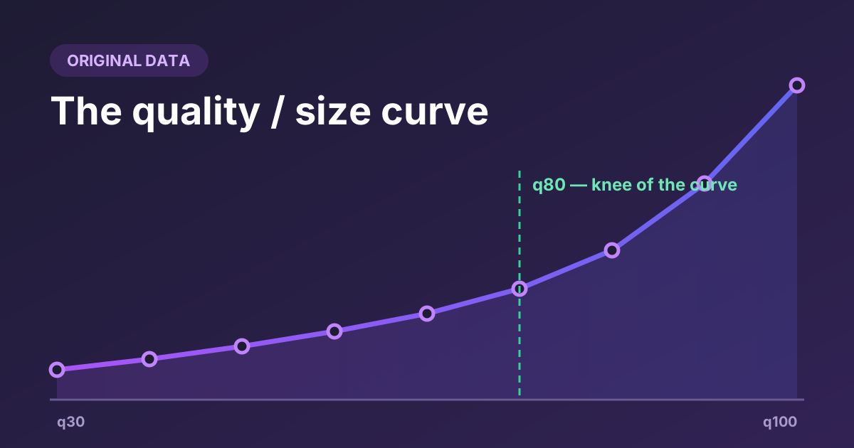
Read across any row and the shape is unmistakable. From q30 to q80 the size grows gently and fairly linearly. From q80 upward it takes off. The portrait more than triples between q80 and q100; the neon still life goes up 3.6×.
Savings against the source file
The same numbers expressed as savings against the original JPEG. Negative means the WebP is larger than the file it came from.
| Image | q30 | q50 | q60 | q70 | q75 | q80 | q85 | q90 | q95 | q100 |
|---|---|---|---|---|---|---|---|---|---|---|
| Foliage | 73% | 60% | 54% | 49% | 46% | 33% | 20% | −2% | −30% | −71% |
| Portrait | 89% | 78% | 71% | 61% | 57% | 43% | 22% | −2% | −44% | −83% |
| Neon still life | 80% | 74% | 71% | 67% | 65% | 58% | 48% | 30% | −1% | −49% |
| Product shot | 83% | 79% | 77% | 76% | 75% | 70% | 64% | 52% | 34% | −2% |
Two things stand out. First, even against already-good JPEG 90 sources, WebP at q80 saves 33–70%. Second, the column of red on the right is the phenomenon our converter warns you about, quantified: past a certain quality, converting to WebP costs you bytes instead of saving them.
What each extra 5 points costs
This is the table that changed how we think about the slider. Each figure is the additional bytes that quality step adds, expressed as a percentage of the q80 file — so you can see what you are paying, in units of the file you would otherwise have shipped.
| Image | 80 → 85 | 85 → 90 | 90 → 95 | 95 → 100 |
|---|---|---|---|---|
| Foliage | +21% | +33% | +42% | +61% |
| Portrait | +36% | +43% | +74% | +68% |
| Neon still life | +23% | +44% | +76% | +114% |
| Product shot | +21% | +40% | +62% | +119% |
Moving from 95 to 100 on the neon still life adds more than a whole extra copy of the q80 file. You are more than doubling the download so the encoder can preserve detail that was, in many cases, JPEG compression noise in the source to begin with.
The one-sentence version
Below 80, quality points are cheap and you are buying real savings; above 80, quality points get rapidly more expensive while the visible improvement gets rapidly smaller. That asymmetry is the whole reason 80 is the default.
The crossover point
Every image has a quality setting at which the WebP stops being smaller than the source. Ours:
| Image | Character | Crossover |
|---|---|---|
| Foliage | Dense high-frequency detail | q90 |
| Portrait | Smooth gradients, soft background | q90 |
| Neon still life | Large flat colour areas | q95 |
| Product shot | Small, already lightly compressed | q100 |
The crossover is not a property of WebP — it is a property of the relationship between your quality setting and how compressed your source already was. Feed the encoder a JPEG that was saved at quality 60 and the crossover arrives much earlier, because you are asking WebP to faithfully reproduce a file that has already thrown most of its detail away. Our 15-image benchmark caught one file crossing over as low as q90 against a lighter source.
This is why the converter shows a negative saving in red rather than quietly handing you a bigger file. When you see it, the fix is always the same: lower the quality, or accept that this particular file is already about as small as it usefully gets.
Reading the curve for your own images
You do not need a benchmark rig to find your own knee. Convert one representative image three times — at 60, 80 and 90 — and compare.
- Look at the sizes first. If q90 is less than about 25% bigger than q80, your image is flat and forgiving; you can afford a higher setting. If it is 40% bigger or more, your image is detailed and every point above 80 is expensive.
- Then look at the pixels. Use the Compare button in the converter to wipe between the original and the q60 version at full size. If you cannot see damage at 60, you certainly will not see it at 80 — and you can consider dropping your default.
- Check the worst region, not the whole image. Artifacts appear first in smooth gradients (skies, skin, bokeh) and along hard edges against flat backgrounds. Judging on a thumbnail tells you nothing.
- Decide once, apply broadly. Per-image tuning is only worth it for a handful of images — the hero, the top product shots. Everything else can take the default.
Recommended settings by image type
| Image type | Suggested quality | Why |
|---|---|---|
| Hero / above-the-fold photo | 80–85 | It is the LCP element and the most scrutinised image on the page. Worth a few extra kilobytes and a manual check. |
| Body and gallery photos | 75–80 | The knee of the curve. Best ratio of saving to visible quality. |
| Thumbnails under 400 px | 65–75 | Artifacts are invisible at small display sizes, and these are usually numerous. |
| Screenshots with text | 85–90, or lossless | Text edges are exactly what lossy compression damages first. Consider PNG or lossless WebP instead. |
| Logos and flat graphics | Lossless / SVG | Flat colour compresses superbly without loss. Vector is better still where you have it. |
| Source already at JPEG <70 | 60–70 | Little detail remains to preserve; a high setting only re-encodes the existing artifacts at great expense. |
What this test does not tell you
We measured bytes, not beauty. There is no perceptual quality score here — no SSIM, no Butteraugli — so this data can tell you exactly what a quality setting costs and nothing about what it looks like. Judging that still requires your own eyes on your own images, which is what the Compare view is for.
Four images is also a small sample, chosen to span a range rather than to represent an average. And these results are from libwebp; your browser's encoder may differ by a few percent, and a different format will behave differently again — AVIF in particular holds quality better at aggressive settings, as covered in the format comparison.
What the shape of the curve does generalise well. Exponential growth above 80, cheap savings below it, and a crossover determined by your source quality — those hold across every image set we have measured. If you understand that shape, you can pick a sensible setting for any image without a table.
Find your own knee in about a minute
Queue the same image three times, convert at 60, 80 and 90, and use Compare to wipe between original and result. The sizes and the pixels, side by side.
Open the converter