Responsive Design
Responsive Images Done Right: Mastering srcset, sizes, and picture
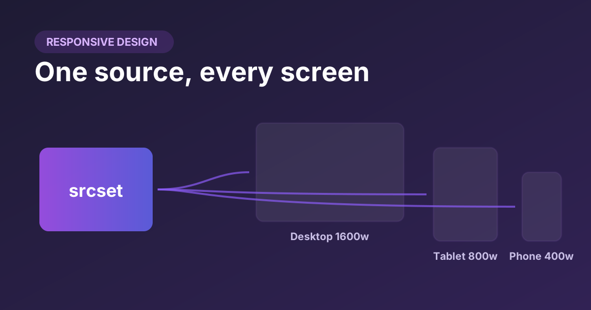
Serving one giant image to every device wastes bandwidth on phones and looks blurry on retina displays. Learn how srcset, sizes, and the picture element let the browser pick the right file for every screen — and why sizes is the attribute everyone gets wrong.
12 min read