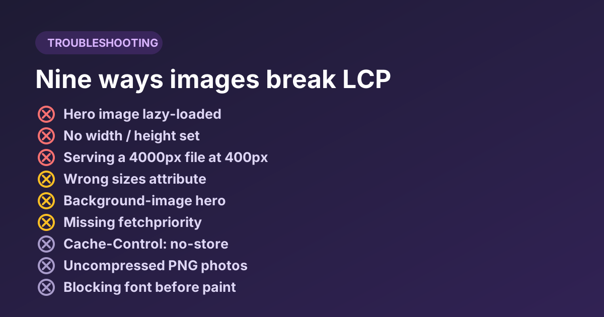
Nine Image Optimization Mistakes That Quietly Cost You LCP
A diagnostic guide, not a listicle. Each mistake comes with the symptom you would see in DevTools or PageSpeed Insights, why it happens, and the exact fix — including the three that show up on almost every site we look at.
How to use this guide
This is written as a diagnostic rather than a listicle. Each entry begins with the symptom — what you would actually observe in DevTools, PageSpeed Insights or the page itself — then explains the cause and gives the fix. Work down the list matching symptoms to your own site; skip anything whose symptom you do not have.
The ordering is roughly by how much damage each one does on a typical content site, and how often we see it.
1. Lazy-loading the LCP image
Symptom: LCP is 0.5–1.5 s worse than you would expect from the image's size. In the DevTools network waterfall the hero image starts downloading noticeably after the CSS and fonts, rather than alongside them. PageSpeed Insights flags “Largest Contentful Paint image was lazily loaded.”
This is the most common self-inflicted image wound on the web, and it usually arrives by accident: a CMS or build tool adds loading="lazy" to every image indiscriminately, hero included.
The mechanism is worth understanding, because it explains why the penalty is so large. Native lazy loading deliberately takes the image out of the browser's early discovery path. The preload scanner — which normally spots images in the raw HTML and starts fetching them before the document has even finished parsing — skips lazy images. The browser instead waits until layout has run and it knows where the image sits relative to the viewport. On a page with render-blocking CSS, that can be several hundred milliseconds after the fetch could have started.
<!-- Wrong: the hero deferred behind layout -->
<img src="hero.webp" width="1200" height="600" loading="lazy" alt="…">
<!-- Right: eager, and explicitly prioritised -->
<img src="hero.webp" width="1200" height="600"
loading="eager" fetchpriority="high" decoding="async" alt="…">The fix: identify the LCP element (DevTools → Performance → record a load → look for the LCP marker, or the “Largest Contentful Paint element” entry in PageSpeed Insights) and make sure it is not lazy. Everything genuinely below the fold can stay lazy. Our lazy loading strategy guide covers where the line should fall.
2. No width and height attributes
Symptom: CLS above 0.1. Text visibly jumps down the page as images arrive. In the DevTools Performance panel, layout shift markers cluster around image load events.
Without dimensions, the browser has no idea how tall an image will be until the bytes arrive, so it reserves nothing. When the image lands, everything below it is pushed down — the reader loses their place, and occasionally taps the wrong thing.
Modern browsers compute an implicit aspect-ratio from the width and height attributes, so you get correctly reserved space even with fully fluid CSS. The attributes are the image's intrinsic pixel dimensions; the CSS still controls display size.
<img src="photo.webp" width="1600" height="900" alt="…">

<style>
  /* Fluid display, reserved space, no shift */
  img { max-width: 100%; height: auto; }
</style>
The gotcha: if your CSS sets height: auto but not max-width, or overrides height with a fixed value that contradicts the attributes, you can reintroduce the shift. Set both, together, in the base image rule.
3. Serving pixels nobody will see
Symptom: Lighthouse reports “Properly size images” with large potential savings. In DevTools, hovering an <img> shows an intrinsic size several times larger than its rendered size.
This is quietly the biggest waste on most sites, and format conversion does not fix it. A 4000 × 3000 photo displayed in a 400 × 300 slot contains 100 times the pixels being shown. Converting it to WebP might halve the file; resizing it first cuts it by 99% before the encoder even starts.
| Approach | Pixels processed | Typical result |
|---|---|---|
| Convert only | 12,000,000 | Large saving on a still-enormous file |
| Resize to display size, then convert | 120,000 | Two orders of magnitude less data |
| Resize to 2× display size (retina), then convert | 480,000 | Sharp on high-DPR screens, still tiny |
The fix: decide the largest size the image will ever be displayed at, double it for high-density screens, and produce nothing bigger. The Cap the width option in our converter does this in one pass across a whole batch. For images whose display size varies by device, go a step further and serve several sizes with srcset.
4. A sizes attribute that lies
Symptom: You implemented srcset correctly and the network panel still shows phones downloading the 1600 px candidate.
The browser has to choose a candidate before layout has run, so it cannot measure how wide the image will be. It relies entirely on what sizes tells it — and if you omit the attribute, the default is 100vw, i.e. “full viewport width”. On a 390 px phone with DPR 3, that is a request for 1170 px of image even if your layout shows it at 150 px.
<img
  src="photo-800.webp"
  srcset="photo-400.webp 400w, photo-800.webp 800w, photo-1600.webp 1600w"
  sizes="(min-width: 1024px) 640px,
         (min-width: 640px) 50vw,
         100vw"
  width="1600" height="900" alt="…">
The fix: write sizes to match your actual CSS layout, and re-check it whenever the layout changes. It is the attribute most likely to drift out of date after a redesign.
5. Hero as a CSS background image
Symptom: The hero renders noticeably later than the text on top of it, and starts downloading only after the stylesheet has been fetched and parsed.
The preload scanner reads HTML, not CSS. An image referenced by background-image is invisible to it: the browser must download the CSS, parse it, build the style tree, match the rule, and only then discover the URL. On a slow connection that is a serialised chain of several round trips before the fetch even begins.
The fix, in order of preference:
- Use a real
<img>and position it with CSS. This is almost always possible and is the correct fix. - If it genuinely must be a background, add
<link rel="preload" as="image" href="hero.webp" fetchpriority="high">in the head so discovery is not gated on CSS.
Note that a background image can still be the LCP element, so this genuinely counts against your score — it is not a technicality.
6. No fetchpriority on the hero
Symptom: The hero is eager and correctly sized, but in the waterfall it still queues behind several other images or scripts.
Browsers assign images a low initial priority, because at discovery time they cannot know which one matters. The priority is raised once layout reveals the image is in the viewport — but by then it has already been sitting behind other requests.
fetchpriority="high" tells the browser at parse time, before layout. It is a single attribute and it is one of the cheapest LCP improvements available. Use it on exactly one image per page — marking everything high is the same as marking nothing high.
7. Photographs shipped as PNG
Symptom: Individual images over 1 MB. Lighthouse's “Serve images in modern formats” audit shows savings of 90% or more on specific files.
PNG is lossless and built for flat colour and sharp edges. Push a million-colour photograph through it and you get an enormous file with no visual benefit whatsoever. In our benchmark the two photographs that had been exported as PNG shrank by 92–94% on conversion — by far the largest wins in the set.
The usual cause is a design-tool export default, or someone taking a screenshot of a photo. The quickest way to find offenders: sort your image directory by file size and look at anything over 500 KB ending in .png.
Keep PNG (or lossless WebP) for: screenshots containing text, line art, diagrams, and flat-colour graphics where any artifact would be obvious. The distinction is explained properly in lossy vs lossless.
8. Cache headers that prevent caching
Symptom: Repeat visits are no faster than first visits. The network panel shows 200 responses for images that should be served from cache, or a stream of 304 revalidations.
Optimising a file and then re-downloading it on every page view undoes most of the benefit. Two settings cause it: a short max-age, and a missing immutable that leaves the browser revalidating on every reload.
# Apache — for fingerprinted image assets
<FilesMatch "\.(webp|avif|jpg|jpeg|png|gif|svg)$">
  Header set Cache-Control "public, max-age=31536000, immutable"
</FilesMatch>
A one-year immutable cache is only safe if the filename changes when the content does — that is what fingerprinting (hero.a91f3c.webp) is for. Without it you have no way to push an update. The caching guide covers the whole pattern, including the Vary header trap that quietly destroys CDN hit ratios when you add WebP.
9. Blaming images for a slow server
Symptom: You have optimised every image on the page and LCP has barely moved.
LCP is not an image metric. It decomposes into four parts, and image weight only affects one of them:
| Sub-part | What it is | Fixed by |
|---|---|---|
| TTFB | Time until the HTML starts arriving | Server, database, caching, hosting — not images |
| Load delay | Gap between TTFB and the image fetch starting | Mistakes 1, 5 and 6 above |
| Load time | Downloading the image itself | Format, quality, dimensions — the image work |
| Render delay | Gap between download finishing and paint | Render-blocking CSS and JS, font loading |
If TTFB alone is 1.5 s, the 2.5 s LCP target is already mostly consumed before an image enters the picture. Measure the split before you optimise. The LCP guide walks through reading that breakdown in DevTools.
A ten-minute audit
Run this on any page and you will find most of the above:
- Identify the LCP element. DevTools → Performance → record a reload. Confirm it is not lazy, has explicit dimensions, and carries
fetchpriority="high". - Read the LCP breakdown. If TTFB is over ~800 ms, stop and fix the server first.
- Sort the network panel by size. Anything over 300 KB is a candidate; anything over 1 MB is a bug.
- Check intrinsic vs rendered size. Hover each large image in the Elements panel. A ratio above 2× on either axis means wasted pixels.
- Scan for missing dimensions. Run
document.querySelectorAll('img:not([width]),img:not([height])')in the console. - Check a cached reload. Reload with the network panel open and confirm images come from disk cache rather than the network.
// Paste in the console: flags oversized images and missing dimensions.
[...document.images].forEach(img => {
  const over = img.naturalWidth > img.clientWidth * 2 && img.clientWidth > 0;
  const noDims = !img.getAttribute('width') || !img.getAttribute('height');
  if (over || noDims) {
    console.log(
      (over ? '[OVERSIZED] ' : '') + (noDims ? '[NO DIMS] ' : ''),
      img.currentSrc || img.src,
      `natural ${img.naturalWidth}x${img.naturalHeight}`,
      `displayed ${img.clientWidth}x${img.clientHeight}`
    );
  }
});
Found oversized images?
Queue the whole set in the converter, set Cap the width to twice your display size, and convert to WebP in one pass. Resizing and format conversion together, which is where the real savings live.
Fix them now